Nourish
Nourish aims to bring softness, strength, and love to fitness and self-care. An online space led by a nutritionist, fitness coach, and mindfulness meditation teacher, Nourish offers private, group, and organizational support to folks seeking a deeper, more attuned approach to wellbeing practices. Nourish believes wellness can be kinder and more accessible than the mainstream fitness narrative, and offers clients intentional, self-loving practices and generous support.
The Project
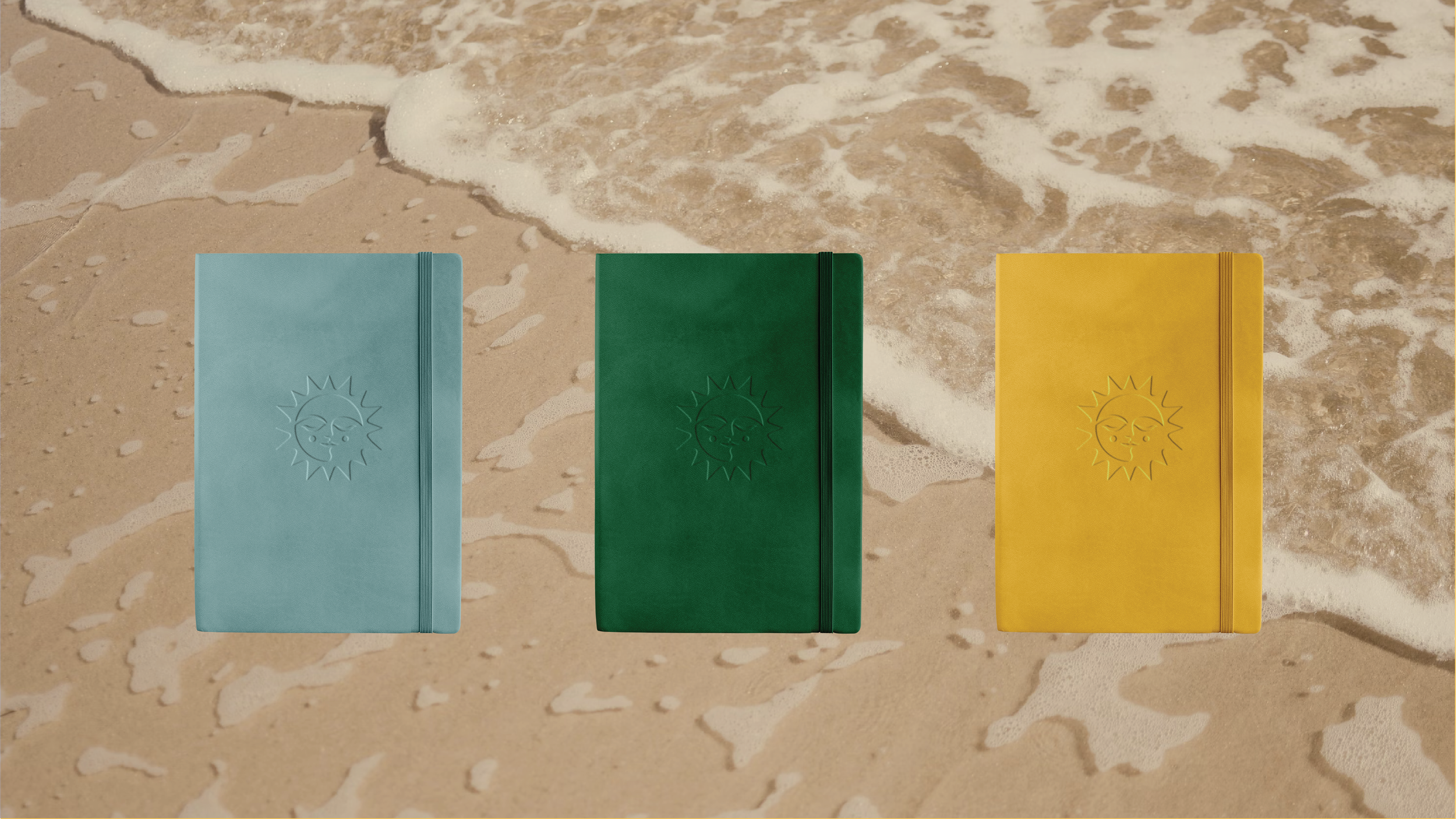
Full brand identity
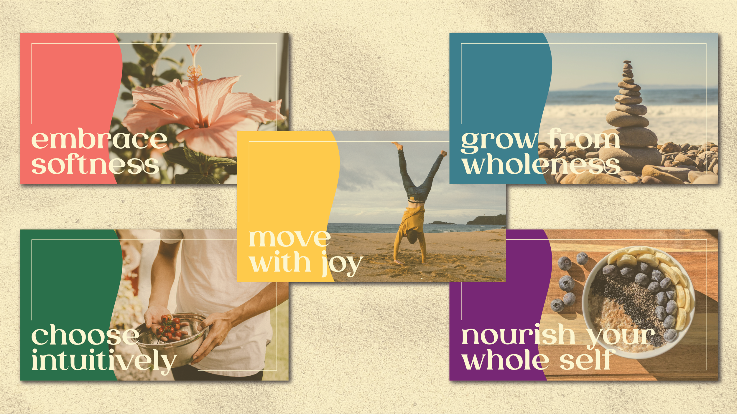
Social media assets
Goals
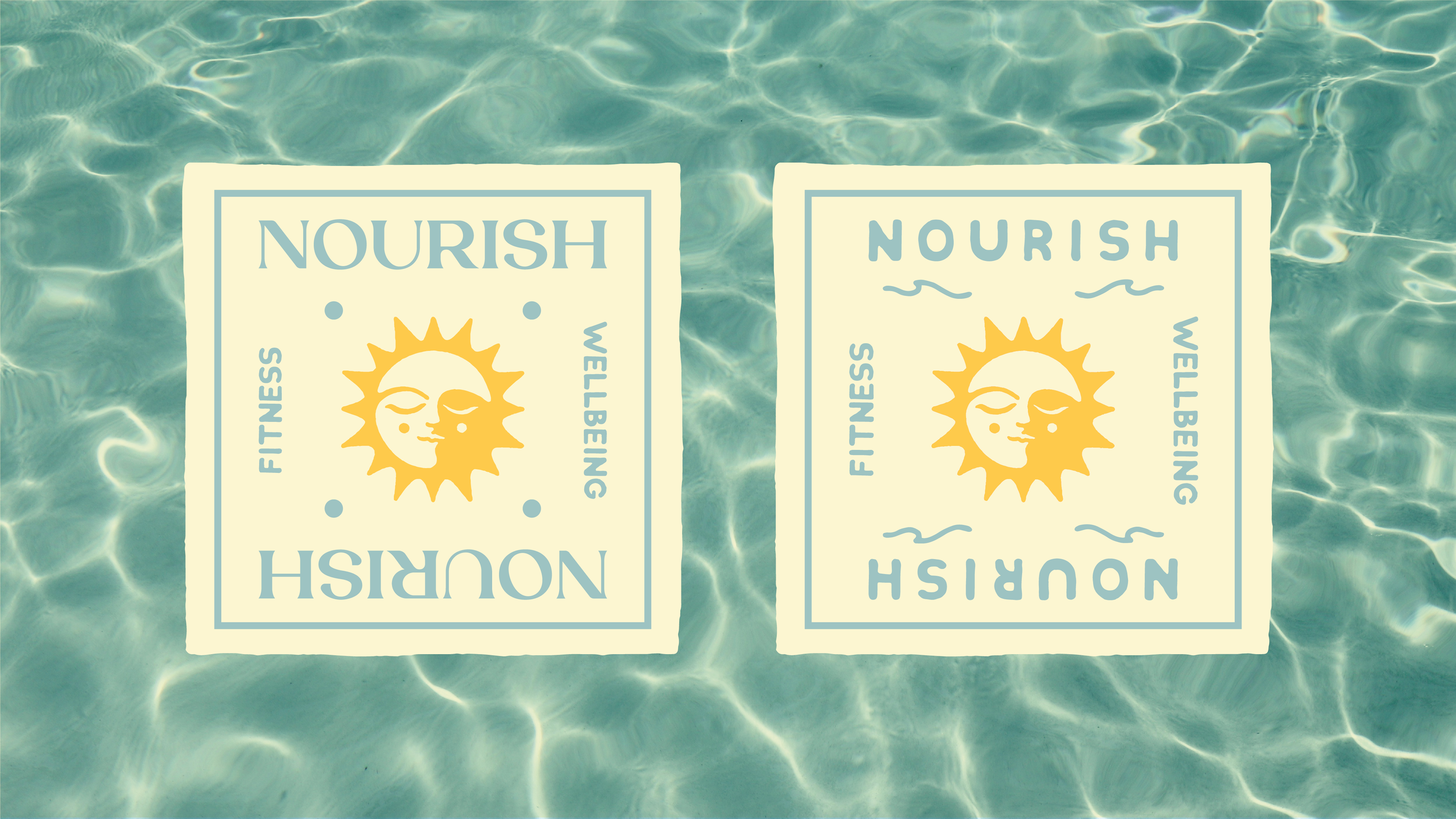
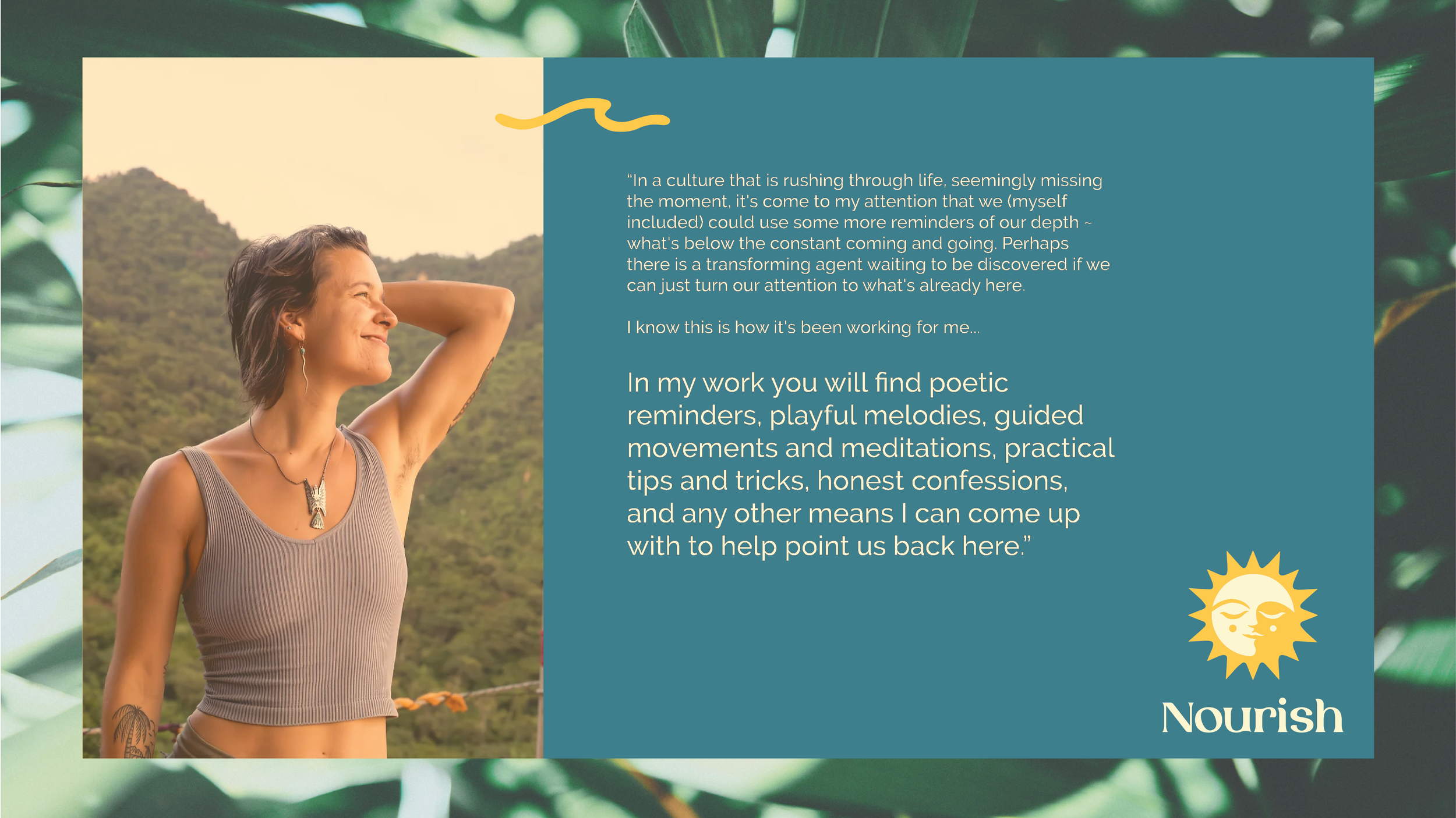
The Nourish philosophy is that fitness, nutrition, and self-care is for everyone and doesn’t need to fit the mold we see at corporate gyms and diet culture. To express this, we wanted to highlight softness through visual design. Story was huge for this brand: the founder’s journey from high-intensity, competitive fitness to a more loving, mindfulness inspired approach to wellbeing needed to be reflected in the brand identity. For the logo, we needed something that conveyed a meditative feeling without relying on the usual wellness design tropes, and that would be able to represent the variety of offerings.
The Brand
The visual design for Nourish is rooted in and inspired by nature’s rhythms as a metaphor for how the body moves and changes. The idea of “flow” was conceptually important to the brand, which shows up in various design elements: lots of cool blues, wave shapes and icons, and logo/display type that has a curviness to it. We chose vivid colors that represent elements of nature, as well as aspects of the self that are touched by wellness practices. As a mostly online brand, we focused on assets that would accompany video content and a simple, easy to navigate virtual practice space. The sun image in the logo symbolizes awakening and fire, yet her face is calm and meditative, which speaks to the energy and overall feel of the Nourish approach to whole-human wellness.


