Make Space
About
Make Space is a non-profit seeking to transform the city of Baltimore through nurturing its creative entrepreneurs and establishing sustainable communities of artists and makers. By converting vacant property to collectively owned live-work space for creative business owners, Make Space works towards both cultivating equity and independence for creatives, as well as combatting the vacant housing crisis in Baltimore City. Through mentorships, workshops, and training programs in professional development and homeownership, Make Space helps creative entrepreneurs build community and ownership.
The Project
Full brand identity
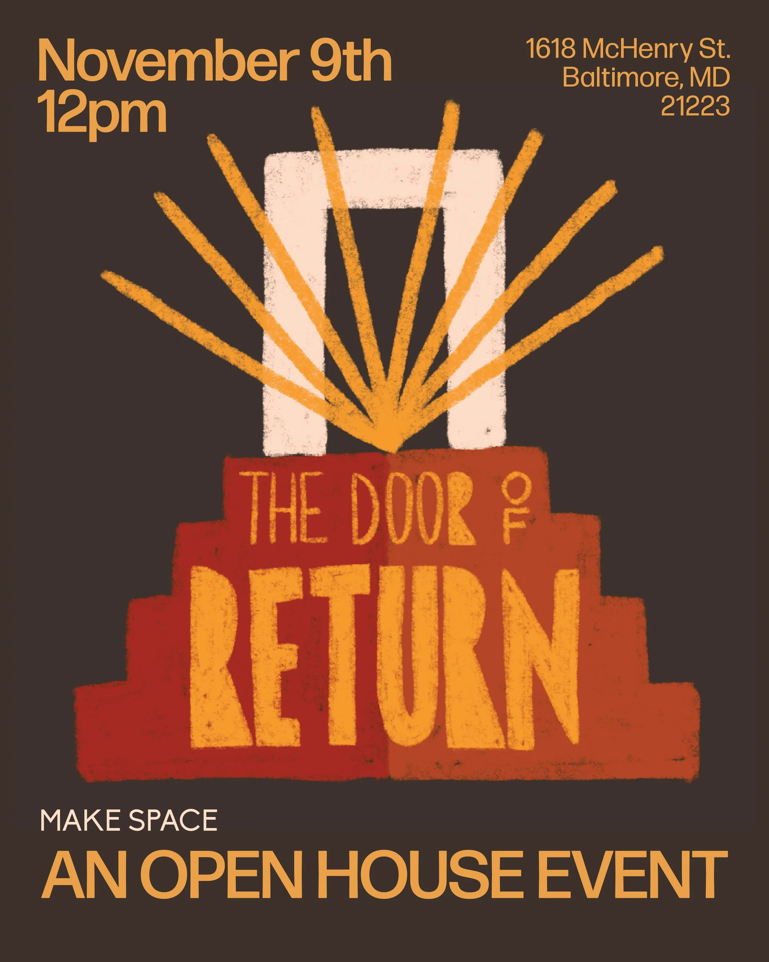
Event collateral
Programming materials
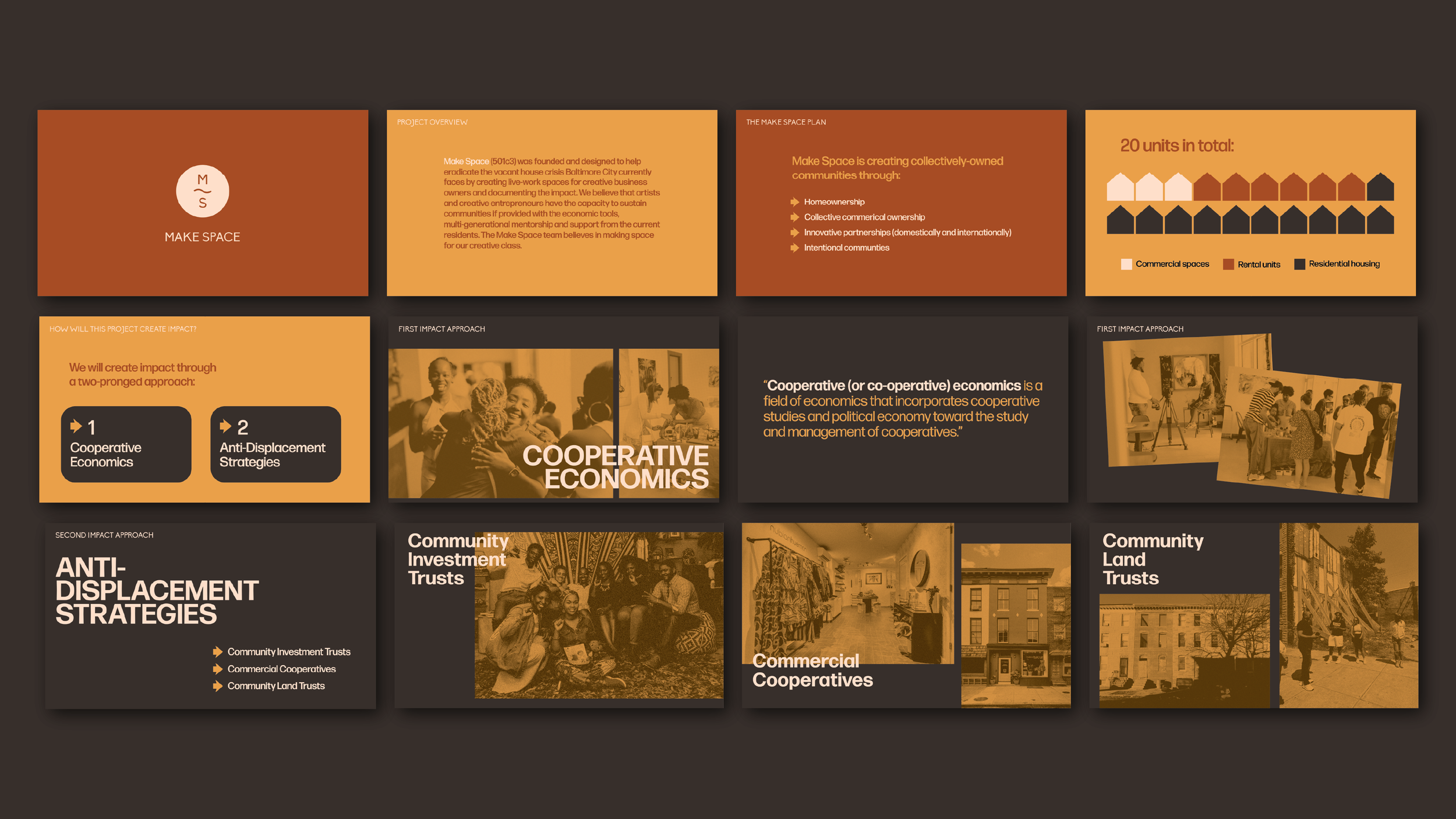
Presentations and documentation
Goals
As a community-building organization, Make Space needed an identity that was warm, welcoming, and felt like home. As an urban development project aimed at creatives, there was also need for an elevated, chic feel that turns heads a little. We knew we needed to strike a balance between the warm, homey feelings and the contemporary, arts-centered aesthetics. The execution needed to give the founder flexibility with adaptable assets that would scale to text-heavy applications, while maintaining the bold-but-professional brand personality across marketing collateral and outreach materials.
The Brand
Color and type led the way for this project. We opted for a rich, warm palette that called to mind earth in the literal sense–soil, clay, sand–to create a cozy feeling, but also to illustrate ideas around reclaiming home and land in an urban setting.
We chose type that would adapt seamlessly as we moved between text-heavy, mostly unsexy applications (like documentation) and public-facing applications as the organization opened up to participants. The typeface used in the logo, while used sparingly, was one designed in tribute to Steve Biko (an anti-apartheid activist in South Africa), with sharp angles and unusual proportions. Forma, our primary typeface, provides flexibility, variety, and a rounded friendliness to contrast.
Targeting creative business owners meant gearing collateral towards folks who we knew were plugged in and had an eye for design. Promotional collateral for events included bold layouts, heavily treated photography, and hand-drawn, abstract illustrations. We emphasized photography that depicted the diversity, joy, and collaboration of a vibrant community of creative entrepreneurs.


