5 Unique Fonts to Inspire Your Typographic Logo
Using expressive typography in your logo is an easy way to achieve simplicity without being boring. Luckily for you, the internet is overflowing with unique and affordable typefaces that would make for a memorable typographic logo.
Typographic logos (also known as logotype or wordmarks) turn a word, or multiple words, into a brand image. Unlike image-based ones, typographic logos rely on the structure of and relationships between letterforms to convey the essence of the brands they represent. Some of the most famous brands use typographic logos– think Ebay, Vans, IKEA, Vimeo.
We see type constantly, every day, everywhere we go, and often don’t think twice about it. That’s the beauty of type: it has the capacity to blend in and feel like part of your environment, or to stand out and punch you right in the face (metaphorically speaking, hopefully). Being the maximalist that I am, I’m drawn to more expressive, unusual typefaces that trigger associations and emotions. But, wordmarks that use simple, more conventional type (like Google’s famous logo) are potent in their directness and simplicity.
Here are some of my favorite font finds from independent designers, with a whole lot of logotype potential.
And…
(drumroll)
They’re all free for personal use!
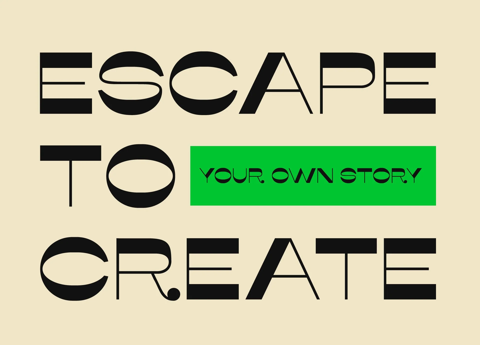
1. Misto
Inspired by the modern architecture of Slavutych, Ukraine, this reverse contrast font balances contemporary design with a hint of nostalgia. The wide letters and unexpected details creates a dynamic typeface and makes great use of negative space.
Designer: Kateryna Korolevtseva
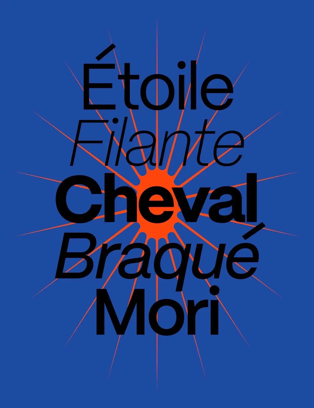
2. Mori
I love this gothic sans serif for its range of possibility. It’s sophisticated and simple, lending itself to subtlety, but bold and can stand out when you need it to. It really pops at large sizes, and has 16 styles, making it incredibly versatile as a primary typeface for a contemporary brand.
Designer: Pangram Pangram Foundry
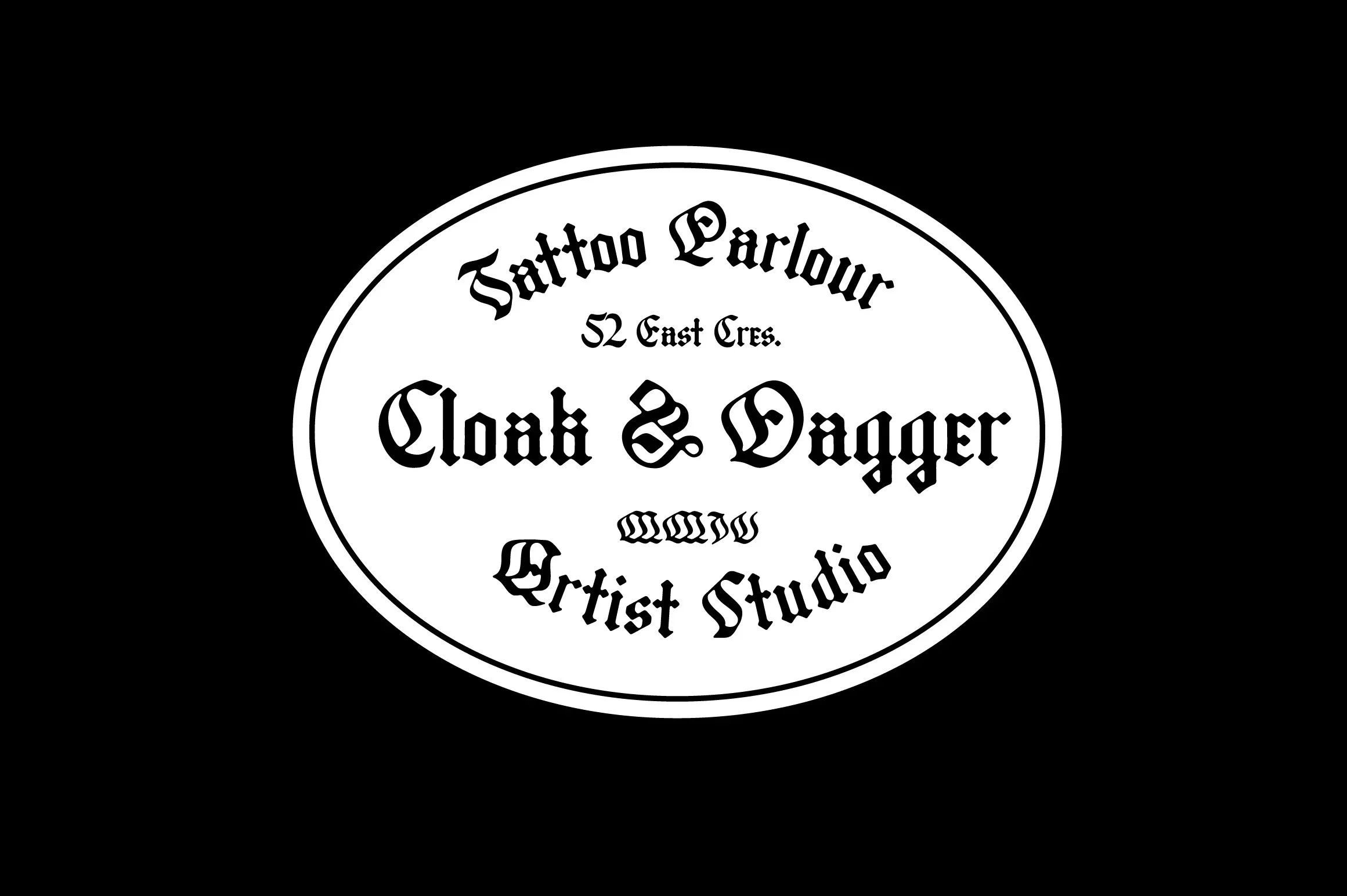
3. Leather Bound
I can’t resist a tough-guy blackletter font, and this one is particularly unusual. The tall height makes it unmissable, and the soft corners give it an aged appearance. It has all the classic details, but with some unusual twists that make it compelling.
Designer: Jeremy Vessey
4. Okta Neue
This one is neutral enough to be a true workhorse, but the almost fully circular round letters and a wide range of weights make it jump right out at you. It’s got high legibility and is extremely versatile.
Designer: Groteskly Yours
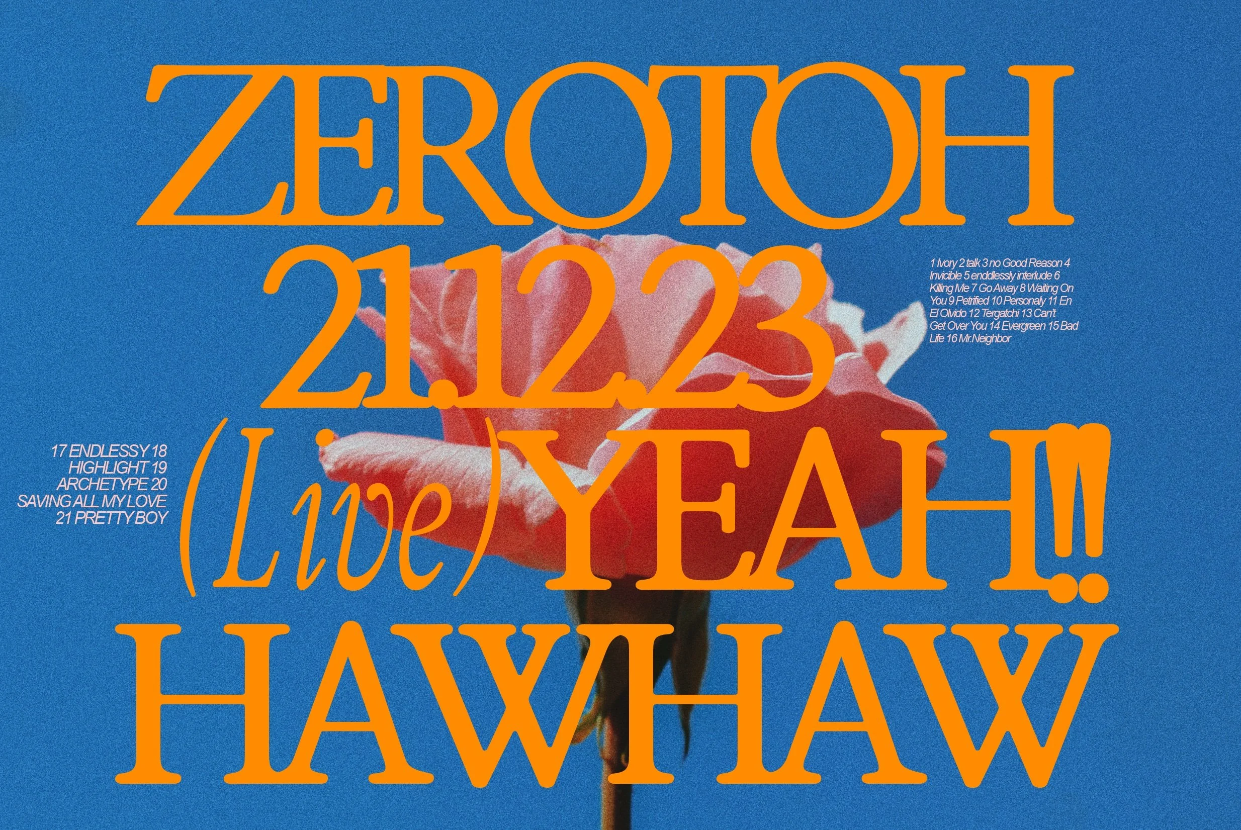
5. ZT Bros Oskon 90s
While the comeback of 90s aesthetics may be subject to rapid trend-shifting, this retro serif still gets big points in my book. It hits on a classic look without being too heavy-handed. It recalls the experimental type of 90s design, but has contemporary versatility.
Designer: Zelow Type
All of these fonts are available to try for free, so play around! Even better, they’re all affordable to license. Who doesn’t love an accessible design resource?


