5 Brands That Are Nailing It with Color
Need a bit of color inspiration? Check out these five brands using color to tell a story and stand out in totally unique and thoughtful ways.
Paro: South Asian Comfort Foods
This brand speaks to my heart. Seeing South Asian brands embracing visual elements of our cultures while subverting tropes and expectations is so joyful and refreshing. The palette here is bold and full of contrast with a combination of warm, earthy tones that reflect the intense flavors and aromas of South Asian cuisine. Complimentary orange and blue are engaging and fearless, balanced by the more subtle (but still high contrast) yellow and rich brown. The saturated blue is reminiscent of the dense dye used in traditional South Asian textiles. Paired with simple illustrations and display type that recalls Pakistani calligraphy, the color is absolutely singing.
Designer: Wedge
2. Gaia: IVF and Fertility Treatment
Gaia is proof that neutrals don’t have to be boring. The fleshy neutrals paired with the strong black type creates contrast that feels serious but soft to reflect both the challenging and optimistic aspects of the fertility journey. The collages of faces and bodies feel intimate and real. The diversity within them reinforces the logotype, which uses non-uniform letters to symbolize the variety of ways family can look. The irregular letterforms and the pops of bright orange and pink accents balance out the otherwise neutral palette to create dynamism. The overall feel embraces imperfection with poise.
Designer: Ragged Edge
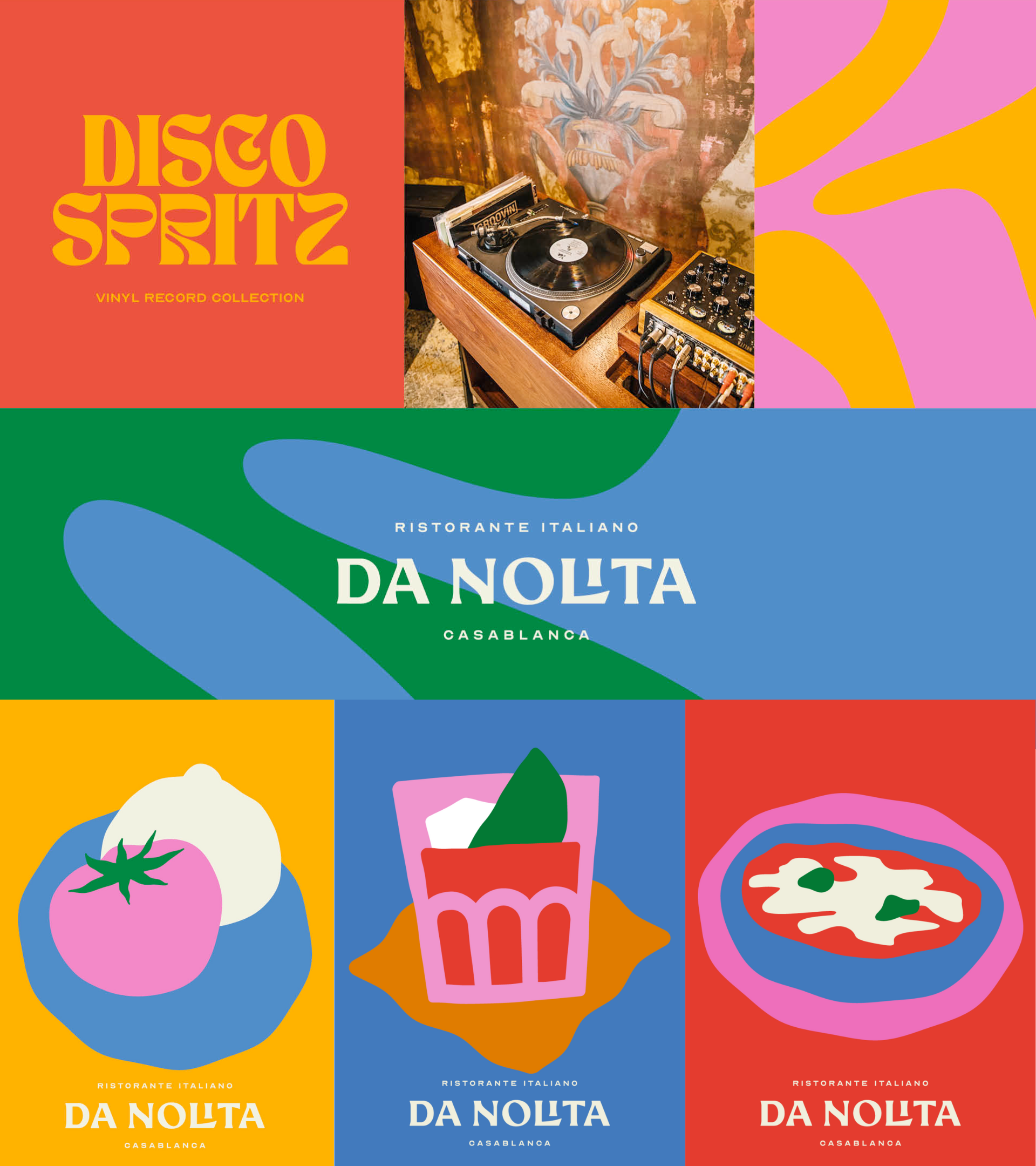
3. Da Nolita: Italian Restaurant
Everything about this rebrand is musical, including the ecstatic color. The vibrant hues highlight the very funk feel, which comes through in the whimsical type; the logo and illustrations, inspired by southern Italy, bring out the Italian influence and a touch of the old-world. The movement captured in the display type and illustrations vibrate with the palette that is attention-grabbing yet comforting, inviting, and—well, dance-y.
Designer: Jona Sbarzaglia Studio
4. High Priestess: Cannabis
Forgoing the done-to-death leafy greens of the cannabis industry, this Black and women owned brand instead opts for moody, sensuous deep red and saturated blue. This palette is darkly femme and daring, especially coupled with the detailed surreal illustrations on the labels. Yet there’s a coziness about it, which is brought out in the product shots featuring vintage-inspired oddities. Green does show up in those, and the light blue labels hint at green as well, so it’s not missed, but it’s not dominating, either. Anyone else dying to lie lounge on that velvety, blood-red fabric?
Designer: Madeline Buanno
5. La Deseada: Specialty Coffee
My career in specialty coffee is behind me, but my inner barista can never pass up a beautiful coffee brand. The colors are warm and natural, like a fresh cup of coffee, and suit the classic but contemporary feel of the logotype. The halftone effect applied to the label images adds variation to the palette with lighter tints of the brand colors. The orange against the simple white of the cups and bags accentuates the strikingly leggy type and draws attention to the unusual serifs.
Designer: Isa Lloret, Setze Studio
Next week on the blog, I’ll be discussing how the simplistic takes on color psychology we see online are missing the mark, and how we can approach color in branding in a more thoughtful way. Keep an eye out!
In the meantime, if you haven’t already, check out Pantone’s 2024 Color of the Year: Peach Fuzz. Personally, I’m a big fan.


